
Class: Graphic Design II
Professor: Mary Treschitta
Software used: Adobe InDesign
For this assignment, we created an employee newsletter for a company of choice. There were no required sections and we had complete creative control. I chose Wendy's because of its clean and legible branding that carries through in everything they do.
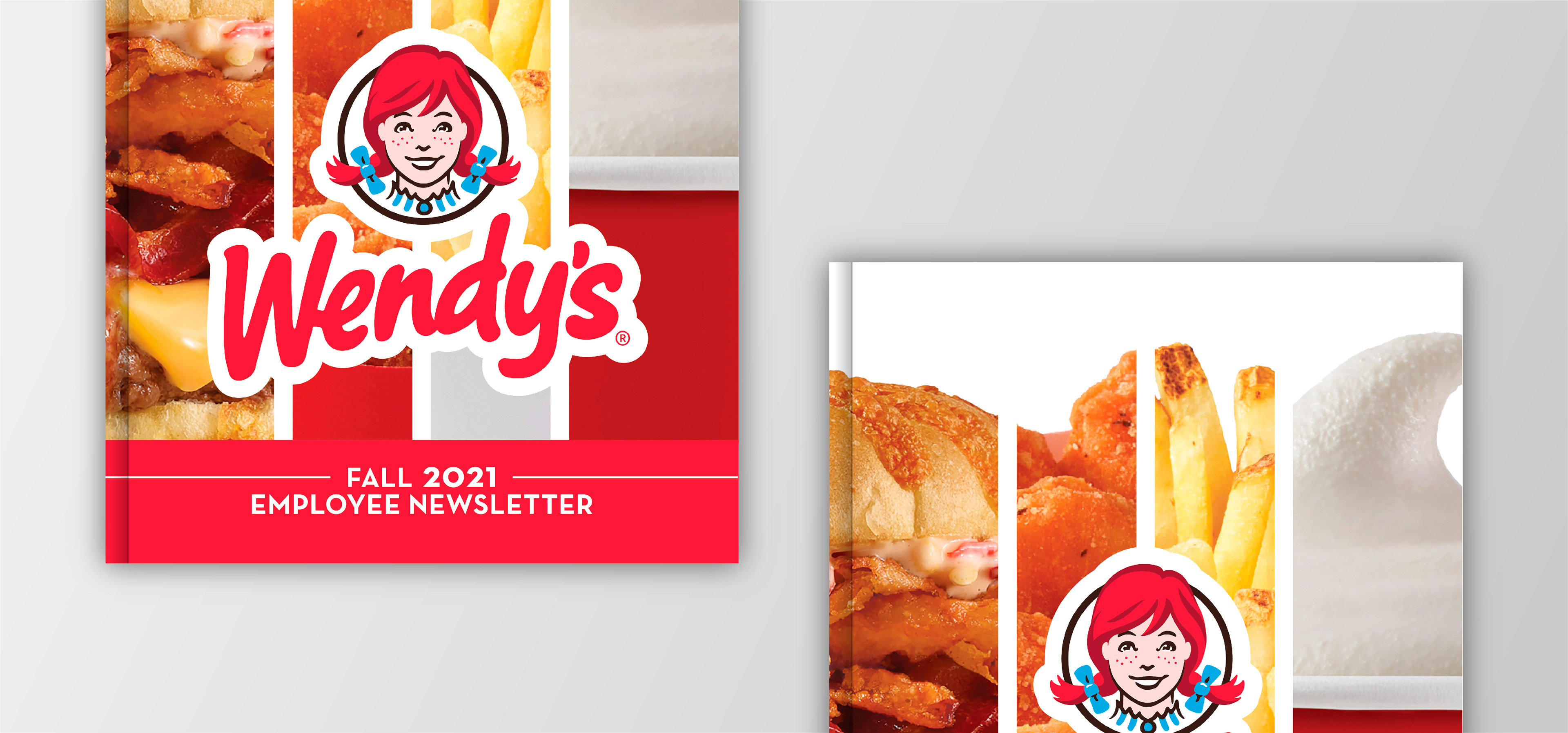
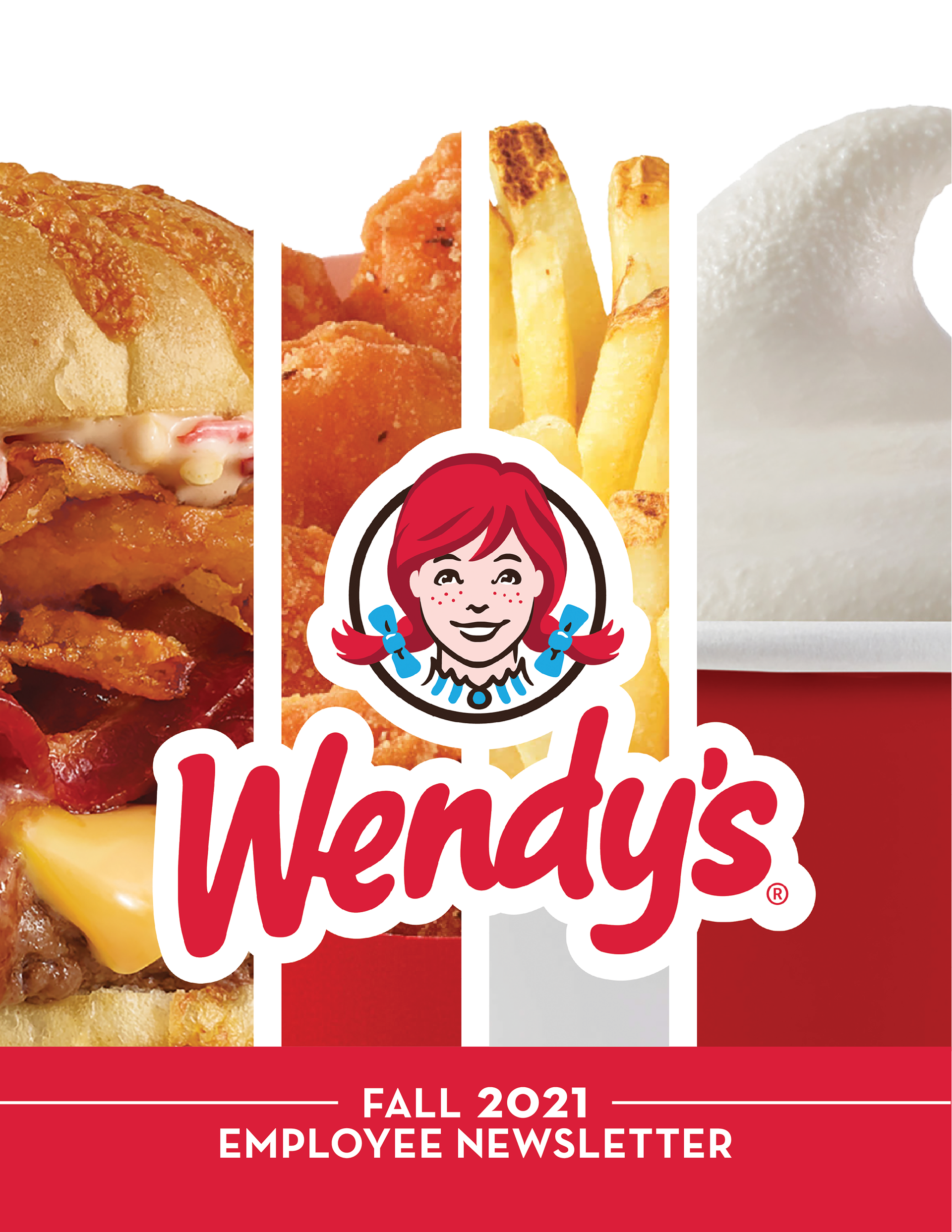
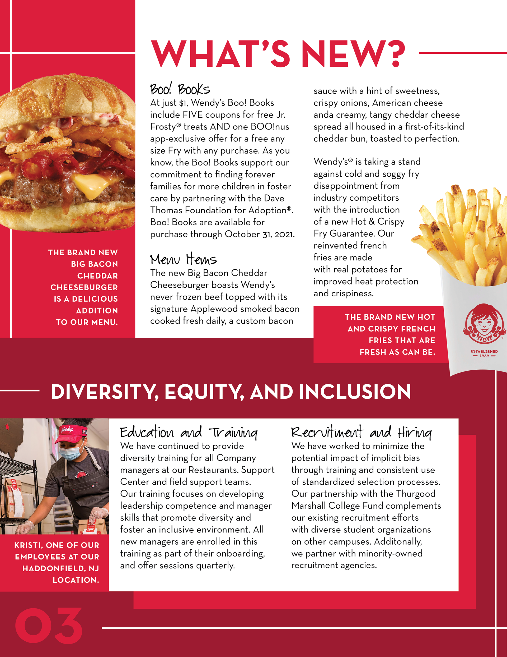
Keeping it consistent with their original branding was key, which is why I used their exact colors and typefaces. For the front cover, the photos within the shapes are meant to resemble a cup of french fries, given they are an essential fast food item. For the following pages, I played around with line work and different-sized rectangles. These elements were inspired by the shapes often found in the architecture of Wendy's buildings. Overlapping these elements also gave the newsletter more depth.
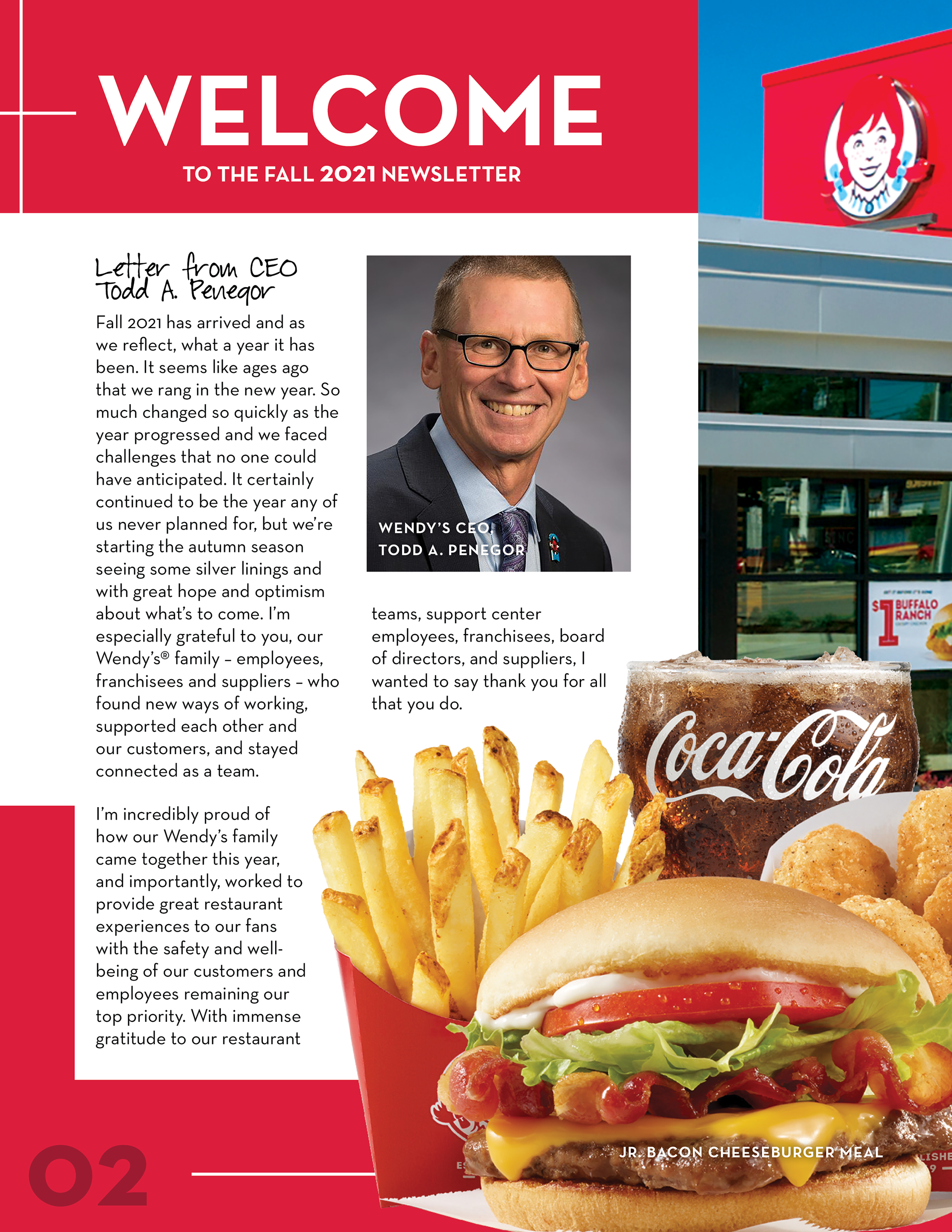
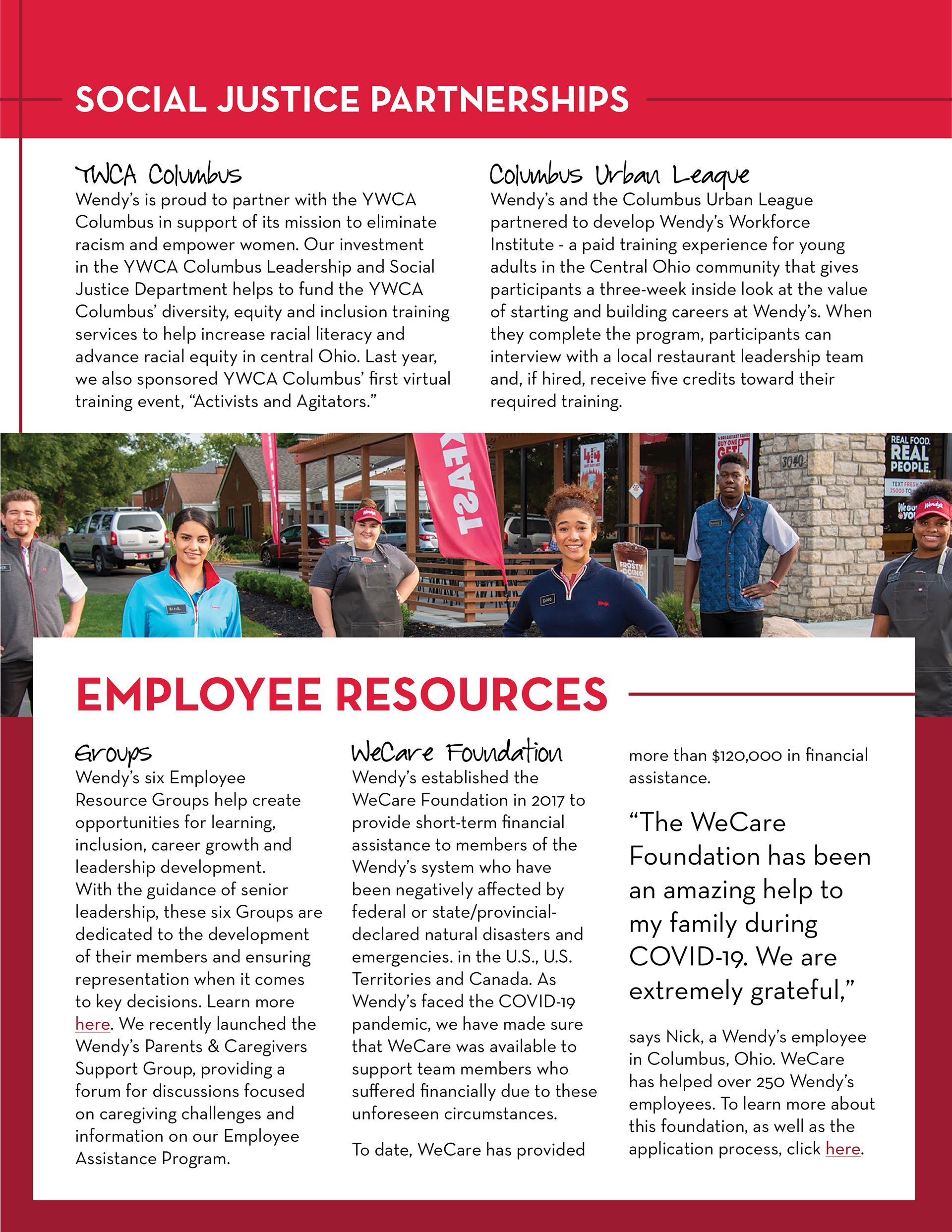
Since the employees are just as important as the food, I felt it was essential to spotlight both. All photos were downloaded from the media image gallery on their website. The body copy was also taken from previous company documents.