
Class: Advertising and PR Writing
Professor: Gary Turco
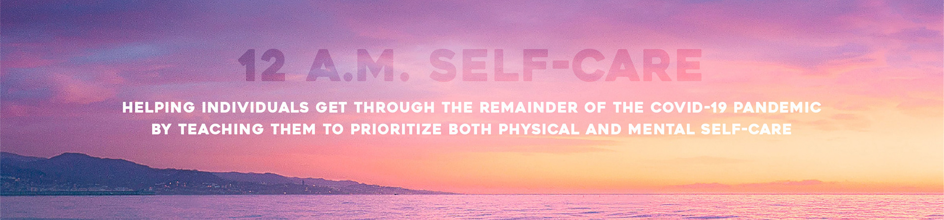
During the spring of 2021, I acted as the Director of Communications for 12 a.m. Self-Care, a company that I made up. It was created with one goal in mind: to help individuals get through the remainder of the COVID-19 pandemic by teaching them to prioritize both physical and mental self-care. The name of my company is inspired by the idea that each day is a fresh start and after the darkness, the sun will always rise again. Our main goal is to provide our community members with an accessible way to take care of themselves, both physically and mentally, through our products and self-care education. Whether that’s prompted journals to write about how they’re feeling, free virtual workshops, or reading our blog, we are dedicated to helping individuals get through the effects of their pandemic days. Love, authenticity, and vulnerability are infused into everything we do.
(All information, unless cited, is purely fictitious).
Logo Design
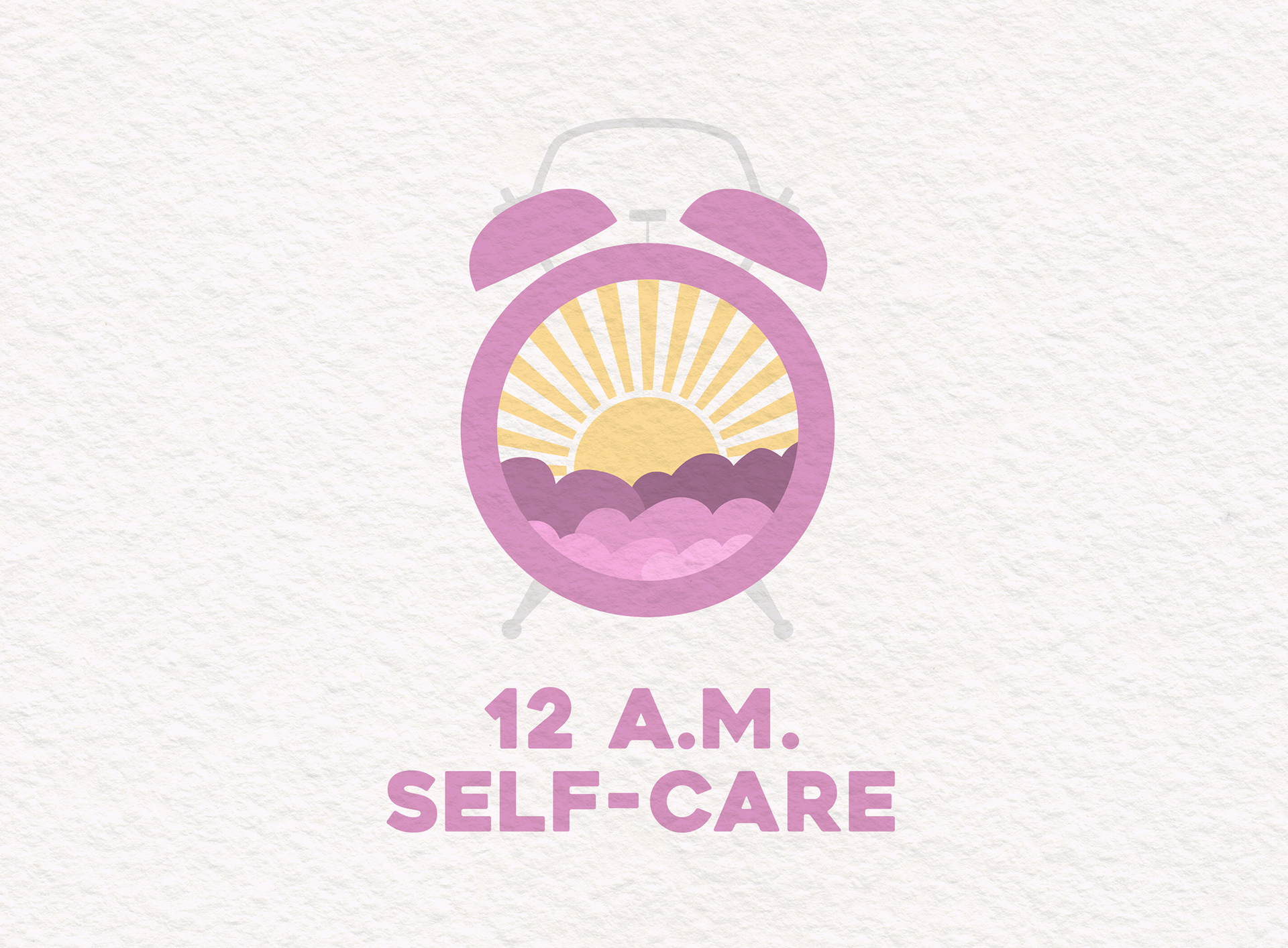
When thinking about my company and what the name represents, I knew I wanted my logo to include an illustrative element of time. I thought the alarm clock was the perfect symbol since it's what wakes you up each morning. As soon as the clock hits midnight, you are given a fresh start to move forward and take care of yourself however you need to. The scene within the alarm clock represents the sunrise, which is when most people actually start their days.
The complimentary colors of yellow and purple were chosen due to their visual tie to sunrises. In the morning, the sky is filled with the light of the sun, as well as beautiful clouds, varying in different colors. This company is more of a modern yet playful concept, which is why I chose a sleek sans serif typeface.
Advertising Materials
One of our assignments was to create a product to sell, as well as a print and digital advertisement. I created the Reflective Coloring Journal, which combined a coloring book and a regular prompted notebook. Through my research, I found how beneficial these things were separately in order to ease stress. Creating a product with both elements seemed like a fun and unique form of self-care. In terms of the physical look of it, I chose a trendy and modern typeface pairing. I also kept the colors gray and white for a calming experience.
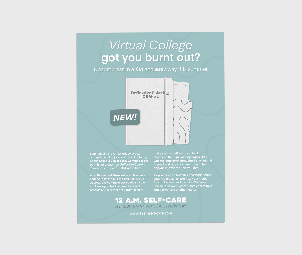
For the print ad above, my target audience was New Jersey college students who were finishing up their first virtual school year. My heading, subheading, as well as body copy kept all of that in mind. I wanted the viewer to feel relaxed as they were looking at it, which is why I chose the main color of teal blue. The background includes the squiggly lines on the journal and the "New!" label incorporates the product's rounded edges.
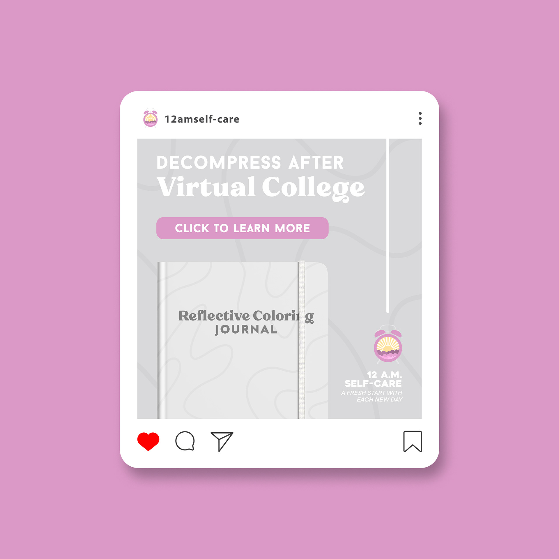
For the digital ad above, I chose a simple design style. The target audience was broader: any female college student finishing up their first virtual school year. Similar to the print ad, I wanted the viewer to feel calm while looking at it; the colors were chosen for that reason. The button, "Click to Learn More", is vibrant pink to catch your eye and the right line prompts you to look at our logo, prompting brand awareness.
PR Materials
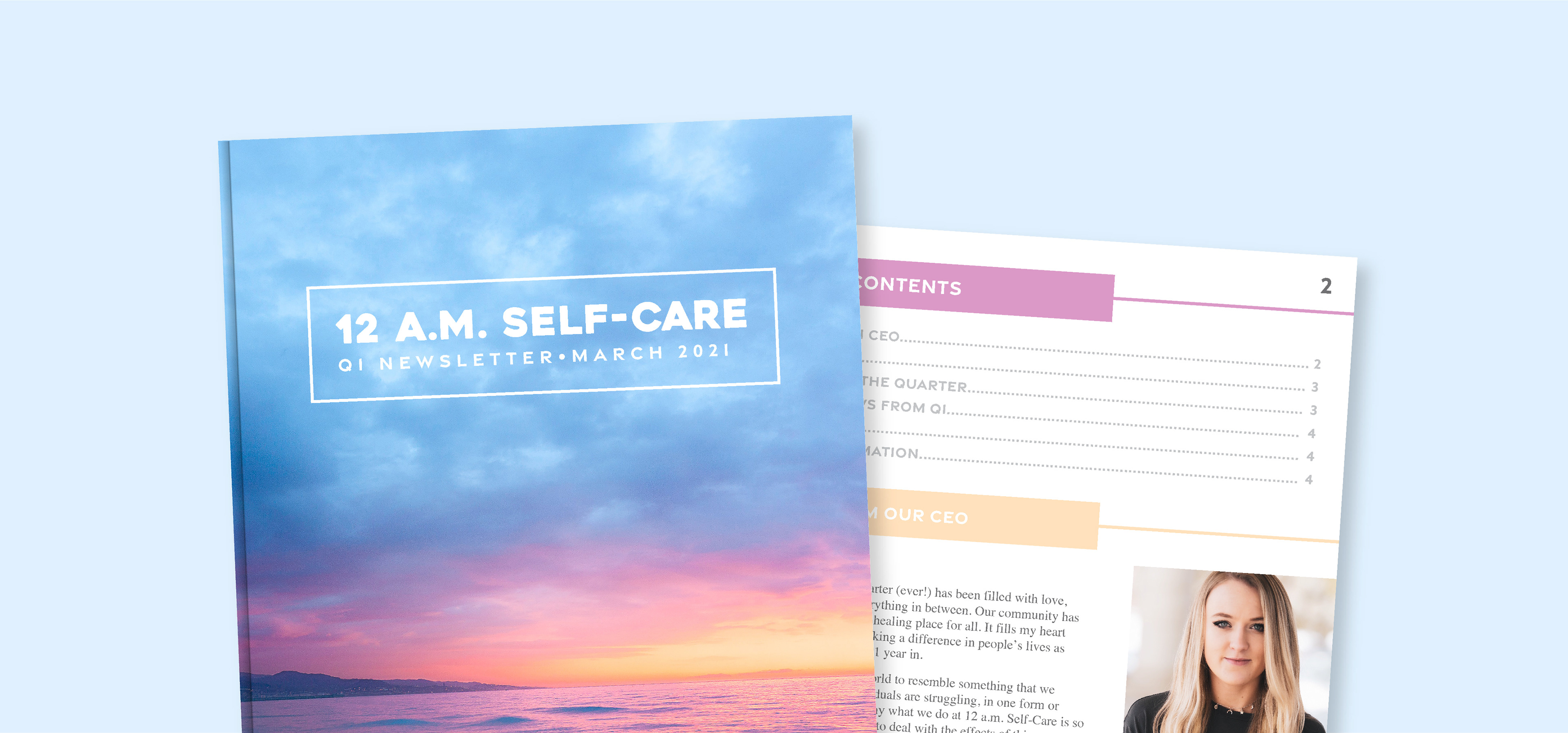
Q1 Newsletter
Created in Adobe InDesign, this document talks about our accomplishments from the first quarter in business.
Media Advisory
This document was written to urgently let the press know about our (fake) virtual news conference announcing our (fake) partnership with the New Jersey Department of Education on a 1 week state-wide Self-Care Workshop for all Public School students.
Pitch
This document was written with a specific journalist in mind. I was reaching out to extend a personal invitation and persuade them to view our (fake) virtual news conference announcing our (fake) partnership.
News Release
This document was released after our (fake) virtual news conference and talks more in-depth about the (fake) Self-Care Workshop for all NJ Public School students in grades K - 12.
Op-Ed
I wrote this document to argue that colleges should not have taken away breaks during COVID-19 and related it to mental health struggles students are currently facing.